This article is especially for new designers who are just starting out.
Frutiger font is popular among designers.
The typeface has been loved by many designers since its birth and has become a typeface that we see all around us because of its legibility and universally beautiful typeface design.
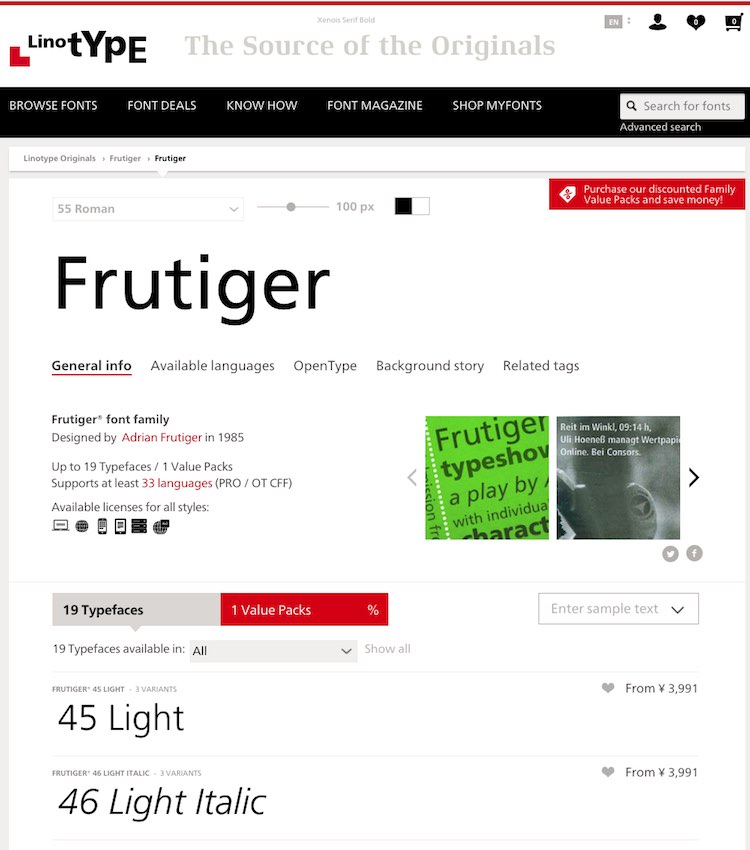
If you want to purchase the Frutiger font from the online store of Linotype, the distributor, you will have to pay from 3,991 yen per weight. If you want to purchase a set of all 19 weights, it will cost you 34,093 yen. (Prices as of February 9, 2019.)
The price is not expensive considering that the font can be used for a lifetime after purchase. However, for a novice designer, it may be difficult to afford it because of other equipment that needs to be prepared.
Here are some compatible fonts that you can use instead when you want to use Frutiger, which are easily available from applications, OS bundles, and free Google Fonts.
type sample
Frutiger
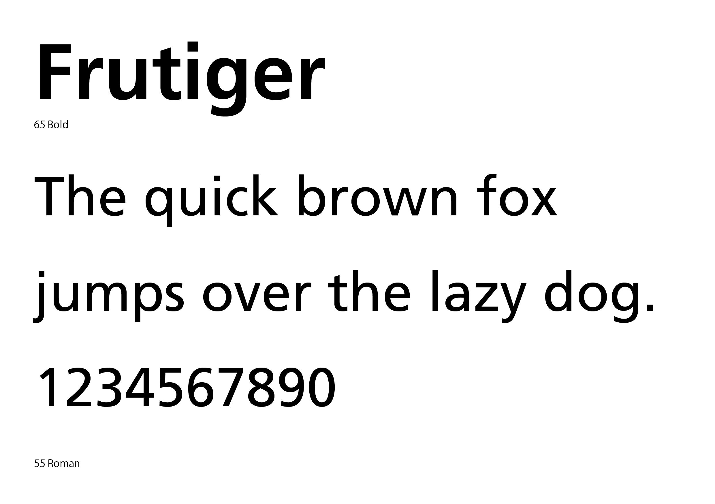
First, here is the original Frutiger as a reference; Frutiger is called the “humanist sans serif”. The image shows the Frutiger LT series purchased from Lynotype.
Myriad Pro
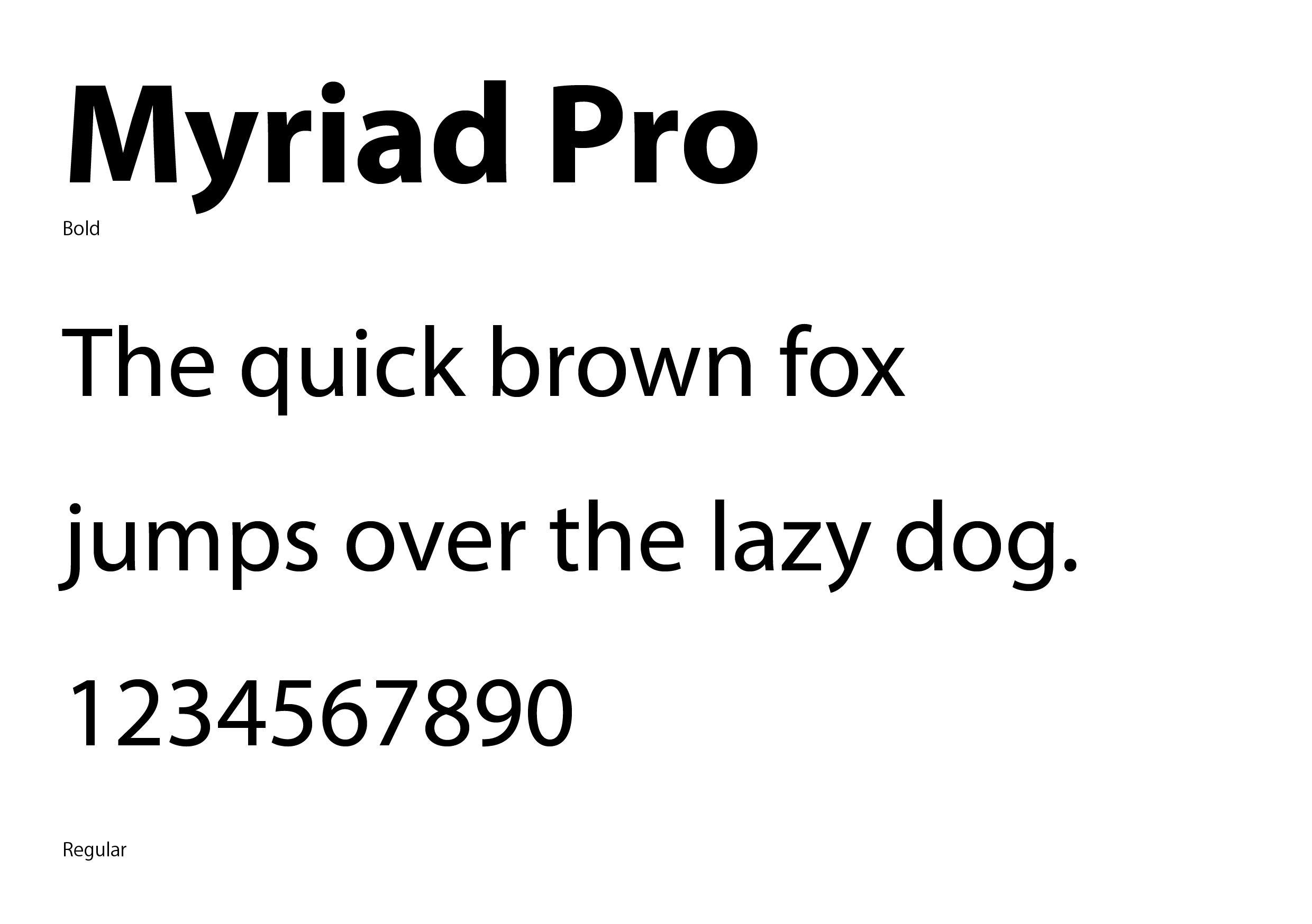
Attached to Adobe paid applications such as Illustrator, Photoshop, CC (Creative Cloud), etc.
Fonts that become available after installing Adobe’s paid software.
Myriad’s letterforms are quite similar to Frutiger. The font is as rich in weights as the original Frutiger, making it an easy-to-use typeface.
I often use it when I want to use a typeface that looks like Frutiger, but I want to make a change from the original.
Lucida Grande
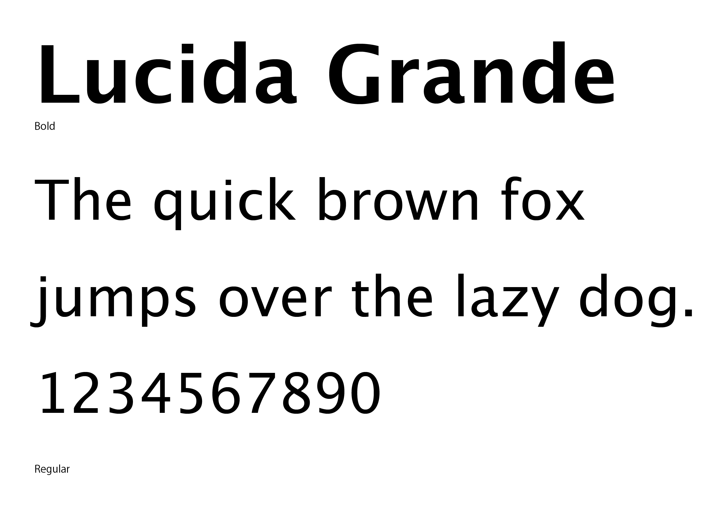
Standardized in Mac OSX
This typeface was the standard font for Mac until OSX 10.10.
Named after the word “lucid,” which means “clear” and “easy to understand,” the font was designed for high visibility when printed in small sizes or displayed on low-resolution screens. The font is designed for high visibility when printed in small sizes or displayed on low-resolution screens.
The font is very easy to read, but note that there are only two weight developments, Regular and Bold.
Calibri
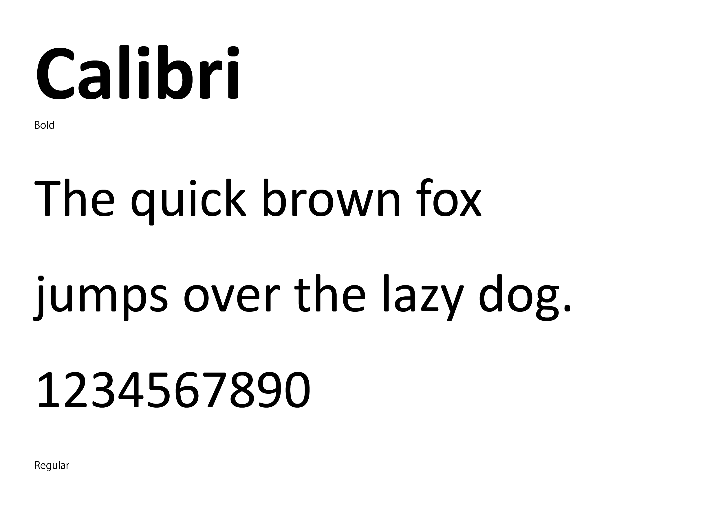
Comes standard with Windows; included with Microsoft Office
These fonts are created by Microsoft and come standard in Windows, and are also available on the Mac when Microsoft Office is installed.
The letter skeleton is quite similar to that of Futura, but Calibri has slightly more rounded corners, giving it a softer look.
Tahoma
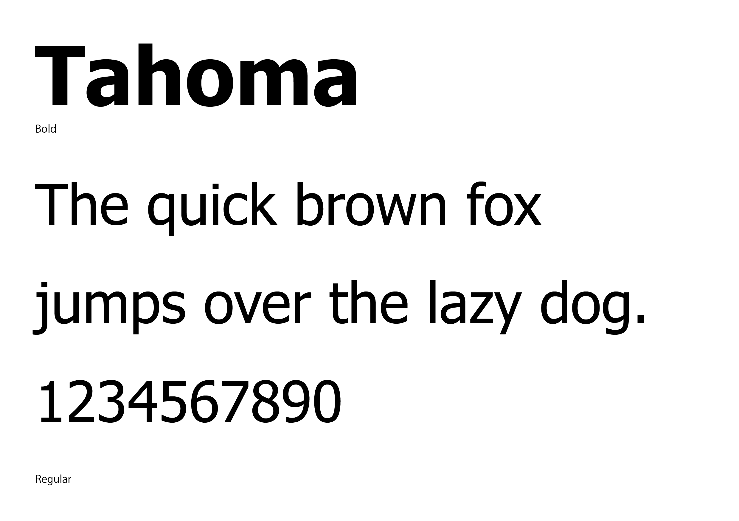
Standard for both Mac and Windows
Tahoma is a standard font for both Mac and Windows, also developed by Microsoft, and is quite similar to Lucida Grande.
Like Lucida Grande, Tahoma is available in only two weights, Regular and Bold.
Open Sans
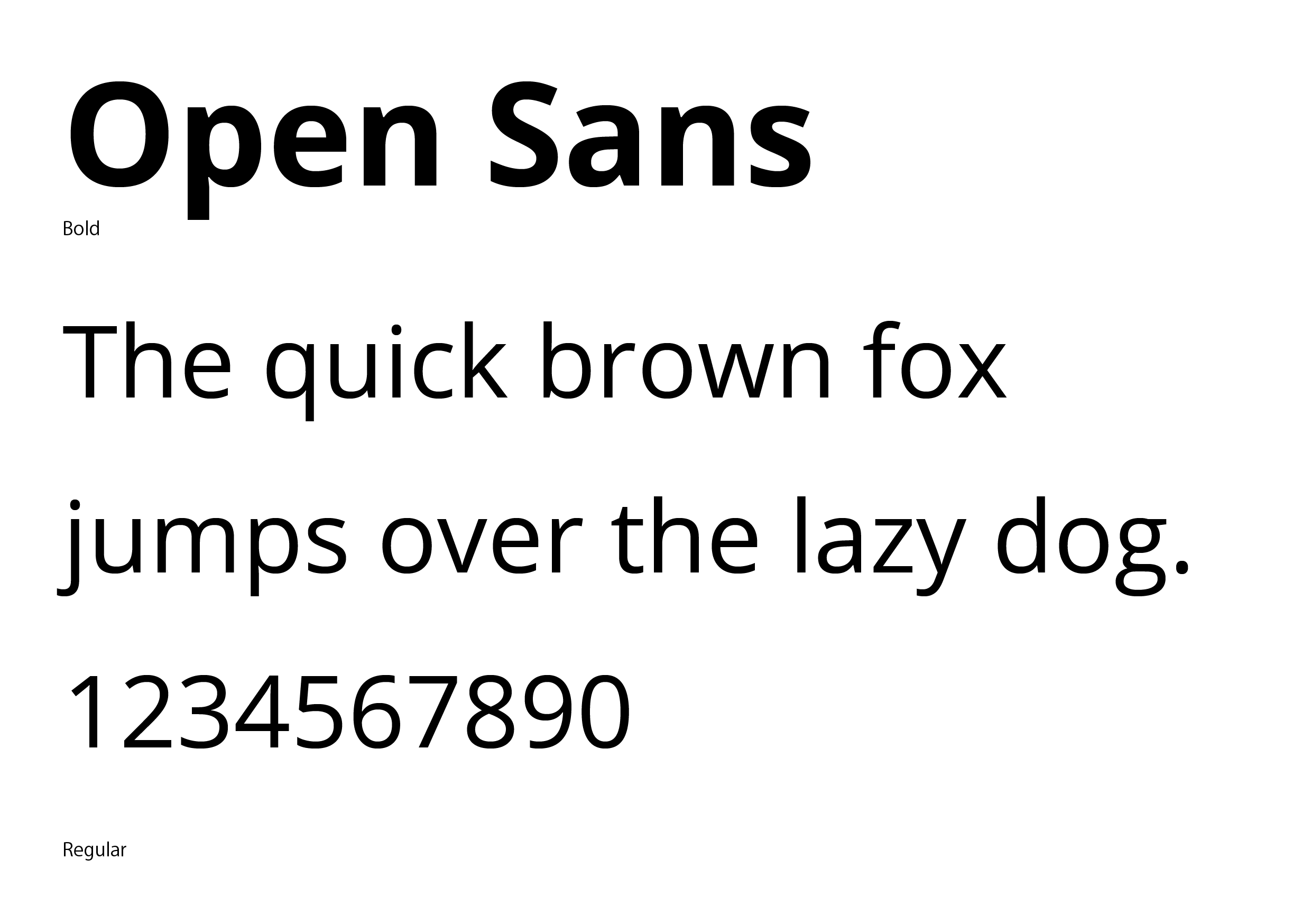
Google Fonts: Free download from the following URL
https://fonts.google.com/specimen/Open+Sans
The fonts are from Google Fonts, an open source font service provided by Google, and can be downloaded and used free of charge.
Although the shape of the “g” differs from that of the original Frutiger, the numbers and other basic features are similar.
Ten different weights are available, making it easy to use from body text to headlines and creating a unified design tone.
Many of the fonts provided by Google Fonts are recent in age when they were designed, so the fonts have a new look.
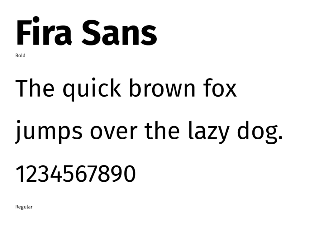
Fira Sans
Google Fonts: Free download from the following URL
https://fonts.google.com/specimen/Fira+Sans
This font is also provided by Google Fonts.
Font developed for the famous web browser “Mozilla Firefox” and Firefox OS.
The weight range is quite extensive, with 18 different weights.
The similarity with Frutiger is not that high among the fonts introduced in this issue, in terms of the solidity of the number’s expression and so on. However, it has a more futuristic atmosphere, so I use it when I want to use a font that looks like Frutiger, but with a newer atmosphere.
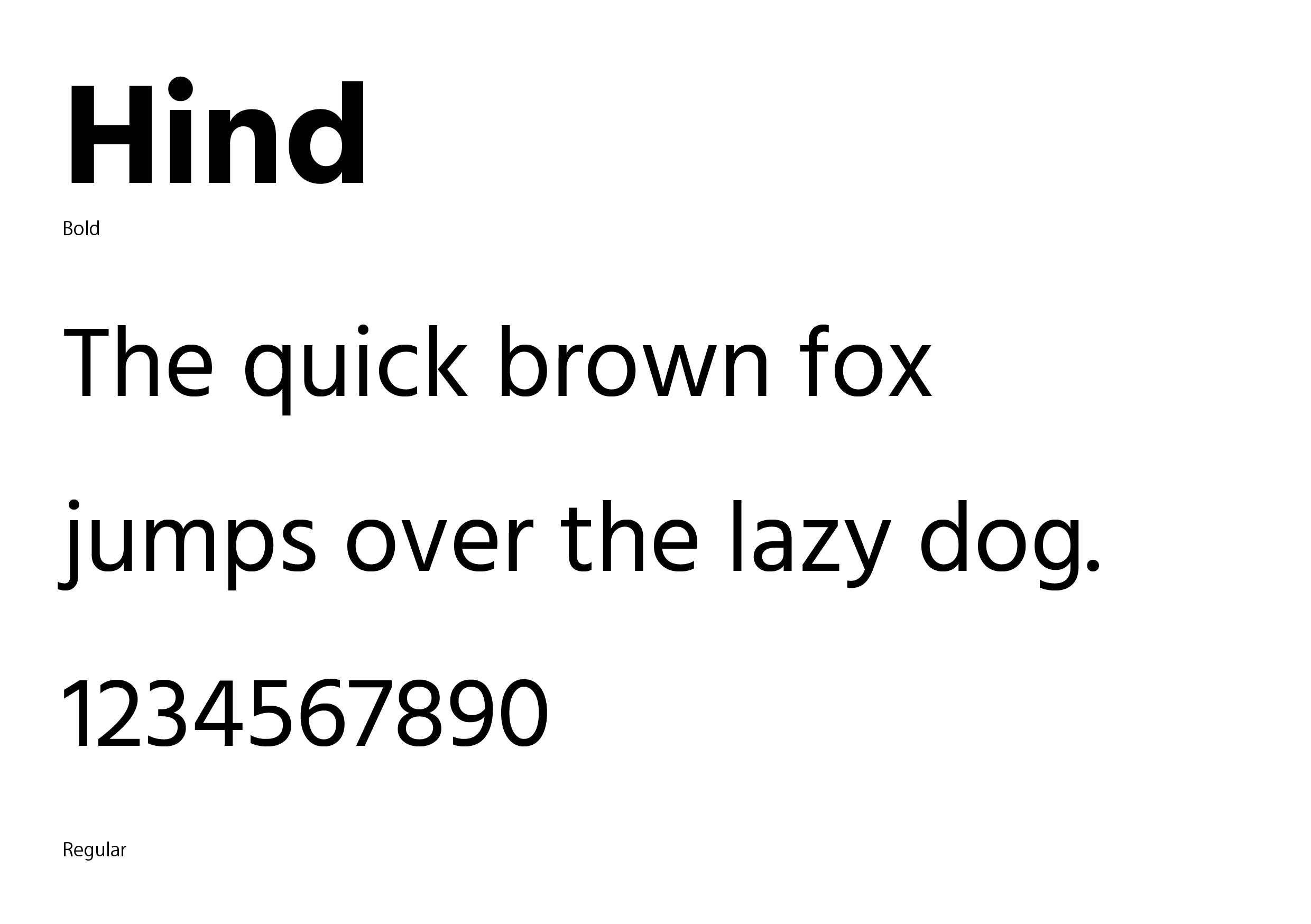
Hind
Google Fonts: Free download from the following URL
https://fonts.google.com/specimen/Hind
Fonts provided by Google Fonts.
This Hind looks quite a bit like Frutiger! The numbers, the shape of the “g”, etc., are all so similar that unless you are a serious Frutiger fan, you would probably mistake the two side-by-side.
The Frutiger compatibility is very high, but unfortunately there are no italics, and only orthographic weights are used. If you need italics, you may need to use italic effects in your application.
The Frutiger-compatible fonts introduced here are all of high quality, although the similarity to Frutiger is different. Please use these fonts to improve your designs.
And by all means, buy the original Frutiger!
By using the real thing, you will realize why Frutiger is loved by so many designers.
Related Books
Adrian Frutiger – Typefaces: The Complete Works


コメント